
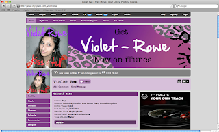
Monday, 31 January 2011
Finished Website
This is my final MySpace, it has been linked to the blog but I have also print screened it.
Friday, 28 January 2011
Response To Album Covers
I printed a copy of each of the album covers and showed them to 30 pupils aged between 14-19 years old. I did a tally chart on the back as I asked each pupil which album cover they would be most attracted to buy if in a music shop such as HMV.
 This image got 16 votes. I also got feedback such as:
- 'I love the font'.
- 'The hair is cute and the bold colours really contrast well with the faded picture of the face'.
- 'The off-the-shoulder top really goes with the theme, as the other outfits on the other covers don't really'.
 This image got 4 votes. I also got feedback such as:
- 'The glitter makes it really girly and Kesha-like' (The artist we are compared to)
- 'I don't think the hair has enough character to it to be honest'
- 'The title looks quite messy to me'.
 This image got 6 votes with feedback such as:
- 'I like how this is different as it's self titled'.
- 'The 'V' is a good idea but it needs to be tidied up a bit to make it look more professional'.
- 'The colour is really good here, and the eyes look sharp'.

This image got 4 votes with feedback such as:
- 'The font is so cool here!'
- 'I like how she looks like a cartoon here'
- 'She does look like an out of control artist here'
From this, I concluded that I would use the first album cover. This won't be hard to edit the MySpace page as I have the template ready to easily change.

- 'I love the font'.
- 'The hair is cute and the bold colours really contrast well with the faded picture of the face'.
- 'The off-the-shoulder top really goes with the theme, as the other outfits on the other covers don't really'.

- 'The glitter makes it really girly and Kesha-like' (The artist we are compared to)
- 'I don't think the hair has enough character to it to be honest'
- 'The title looks quite messy to me'.

- 'I like how this is different as it's self titled'.
- 'The 'V' is a good idea but it needs to be tidied up a bit to make it look more professional'.
- 'The colour is really good here, and the eyes look sharp'.
This image got 4 votes with feedback such as:
- 'The font is so cool here!'
- 'I like how she looks like a cartoon here'
- 'She does look like an out of control artist here'
From this, I concluded that I would use the first album cover. This won't be hard to edit the MySpace page as I have the template ready to easily change.
Wednesday, 26 January 2011
Images
Today, we wanted to film the beginning part of the video on the stairs, so we did this. Afterwards, I thought it would be a good idea to take some more images, which we could use for the album cover. Also, I was in different hair, clothes and make up than before so this would be suitable.
The images are on the group blog.
We should be filming the next bit soon as we couldn't film the first scene as the boy we need was in an exam. Also, we need to film the rest in the drama rooms which are busy right now.
The images are on the group blog.
We should be filming the next bit soon as we couldn't film the first scene as the boy we need was in an exam. Also, we need to film the rest in the drama rooms which are busy right now.
Monday, 24 January 2011
Album Cover Art Designs
I've made 4 different album covers so I can chose which one is most effective. I will give out a questionnaire asking students in my year group which album cover they would chose to pick up.


Saturday, 22 January 2011
Website Update
The banner I created was a few pixels smaller than I needed for the banner of my MySpace page so I made it larger whilst changing the font and adding some leopard print. I added these because I decided that Violet Rowe's image needed to be more edgier. As I know consistency is vital in trying to establish an artist, I then had to edit the font of the album cover, this was fine because me and Natasha D had discussed that we thought a different font would be more appropriate for our target audience.


This is the new banner I designed:

So the new album cover looks like this:

The MySpace page now looks like this:

Friday, 21 January 2011
Website Update
I have played around with the MySpace designer and found that I could input a banner. I made one (below) advertising the artist and her album. I think Violet should be her signature colour, however, I will easily change this banner when we have the finished album cover, this again is just a draft.

I put hand prints on the side as this artist is one that is trying to break out of the 'typical pop star' stereo type, she produces catchy songs that appeal to most. The hearts in the hand print show a juxtaposition of her feminine side and her rebellious side.
Thursday, 20 January 2011
Album Artwork
Today, me and Natasha went to the drama studios to take some images for our album cover. The typical conventions of an album cover for a pop artist is normally a close of the artists face, to show their importance without the need for props. We took a few images with props so that we had a selection (these will be on our main blog)
However, at home I uploaded the images and edited one to get a basic idea of how we wanted it to look. Below is the image I practised with which I will show Natasha D tomorrow and hopefully we will use it as inspiration for our final album artwork.

However, at home I uploaded the images and edited one to get a basic idea of how we wanted it to look. Below is the image I practised with which I will show Natasha D tomorrow and hopefully we will use it as inspiration for our final album artwork.

Website Research
I wasn't 100% sure on what a good music Myspace page involved so I looked at current artist's websites to get a feel on how they looked and what they included in them. Here are a few that I looked at:


Wednesday, 19 January 2011
Violet Rowe's Website
I decided that Myspace would be a suitable software to create a website for our artist as it has helped many other artists before because it allows, music to be uploaded and bought and to become friends with other people and artists.
I made an account for our artist which can be found at www.myspace.com/violetrowe
At home, I uploaded:
- A few images of the artist as I realised that a profile with pictures is a lot more attractive than one without
- Some gigs and interviews
- A biography about Violet Rowe
- Added a few established artists and up and coming bands all within the Pop genre to generate more fans
I realised that the layout for MySpace has changed from how it used to be, so I have looked at a few forums to see if people have written tips on how to create an effective MySpace music page. I haven't found anything too helpful yet, but I will play around with it myself to see if I can improve it.
Monday, 17 January 2011
Marketing Plan for Violet
As I had previously made a marketing plan with a fake artist earlier (Reuben Jay), I thought I would make one for my current artist (Violet Rowe) so that I have a good idea of the kind of artist she would be, this will help when coming to design the album cover, the website and even with regards to the acting, filming and editing of the music video. So here is a quick brainstorm of my ideas:

Saturday, 15 January 2011
Artist and Album Name
Today, we decided the name for our artist would be Violet Rowe. We based this on artists such as Pixie Lott and Katy Perry who use 'stage names' within their profession instead of their real names to make a quirky, catchy name. This way it's unique and recognisable if someone was talking about 'Violet'.
We decided the name for the album should be self titled as this seems to be popular with new pop artists as it helps get themselves established.
We decided the name for the album should be self titled as this seems to be popular with new pop artists as it helps get themselves established.
Monday, 10 January 2011
Costume for Artist
So the artist is a pop artist, so I've looked at a few current pop artist to see the type of clothing they wear. Here are a few images that inspired the look that I'm looking for in our artist:

This is Beyonce. This is her on stage performing and she is wearing a floaty shirt and shiny leggings. She's a very empowering artist who has made her mark on the music industry, so her fashion is always pretty god due to the people that choose her clothing. I like this idea and want to use it to inspire the outfit for the artist performing in the video, which is the chorus.
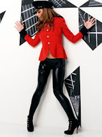 This is Cheryl Cole in her music video. She's also wearing shiny leggings, heels and a bright red jacket. This jacket is eye catching because of the colour, and she is also known for her fashion sense. This outfit inspires the clothing I would want the artist to wear in the bridge of the video because that it when it is supposed to be obvious that it is a music video and not real life, just like Cheryl Coles music video.
 This is Ke$ha, this is the artist who's song we are using so she is a big influence on nearly every aspect of the video and marketing. Here she has a laid back outfit, just a plain baggy top, leggings and biker boots. I think this would be a good costume for the narrative as it's more personal and more just like a normal person. Therefore, I'll see what clothes I can find that slightly resemble this in my cupboard!
 This was a picture of Lily Allen just on a normal day out, but her clothing is also the sort of look that I'm going for. I like how the focus is on the bottom half (leggings) instead of the top unlike the others. It's also a chilled outfit and suitable for maybe marketing my artist.
So these are the images that have inspired me, so I'll be seeing what I can find to resemble these as I know they work well in the industry especially with pop musicians. However, I don't want to completely copy them, as for an artist to break through the music industry, they usually have to have something different about them so they can bring something new, interesting and refreshing to the industry.

This is Beyonce. This is her on stage performing and she is wearing a floaty shirt and shiny leggings. She's a very empowering artist who has made her mark on the music industry, so her fashion is always pretty god due to the people that choose her clothing. I like this idea and want to use it to inspire the outfit for the artist performing in the video, which is the chorus.


So these are the images that have inspired me, so I'll be seeing what I can find to resemble these as I know they work well in the industry especially with pop musicians. However, I don't want to completely copy them, as for an artist to break through the music industry, they usually have to have something different about them so they can bring something new, interesting and refreshing to the industry.
Wednesday, 5 January 2011
Pop Album Covers
Because our artist is from the pop genre, I decided to look at album covers that were specifically from the pop genre. Here are a few of my favourites:


These album covers range from 1999 till present so it shows that most pop album covers use just their face at the front to establish themselves as artists. Instead of breaking this convention, I have decided I want to follow it as it is a debut album so it will be more likely to succeed.


Sunday, 2 January 2011
Post Modernism Within Album Covers

This album by the clash is a perfect example of post modernism. It represents:
- Anger
- Sophisticated
- Artistic
- Real Event
- Black and White
It has the conventional artist name and album name.
The colours clash, which fits in with the artists name.

-This is post modernism.
-The Clash's album was a homage to Elvis's album which shows they're proud and shows they stand fro rock and roll.
-Both album images are in mid action.
-Same font and colours are used.
Parody (making)
Satire (political parody)
Pastiche (taking elements)
Homage
Modernism and Post Modernism within a Music Video
Modernism
- Believes in experimentation.
- Broke boundaries that were set by previous art types.
- Elitist - appealing to most educated.
- 1900 - 1950s
- Stravinski - so shocking it caused a riot.
Post Modernism
- Pastiche.
- Eclectic - taking bits and pieces and putting them in a new context and creating originality.
- Self-referential, refers to itself.
- Wants the audience to be aware it is engaged with a text.
- Breaks the illusion of reality.
- Allusions - reference to another text - intertexuality.
A video that uses famously modernism and post - modernism is Telephone by Lady GaGa ft Beyonce. (This video is already on the blog)
- Their colours and graphics are allusion to Tarantino's Kill Bill.
- It crosses genre between music video and film.
- The jump cuts break the illusion.
- Self referential, GaGa expresses some of the famous rumours about her.
- Placing things that don't go together such as wearing a white dress whilst working out.
- A lot of product placement which helps to break illusion, a parody of product placement.
- Conscious of the production process.
- Madonna Vogue reference.
- Vehicle is an allusion of Kill Bill.
- Thelma and Louise references.
- Subtitles break illusion.
Subscribe to:
Posts (Atom)