
It started with just this image:
I thought this would be a suitable back as it is full on glitter so it's fun and girly because the front is more serious and based on this music. This is bright and reminds the audience that this artist is the best of both worlds: a serious artist (the front) but also a fun person in general.
I then cropped this image into a square and used the purple-ish side for the main image because her name is 'Violet' so it is more personal and post modern.

I then put bright pink stripes up to make the image look more abstract, also pink clashes with purple so creates an 'i don't care' attitude, like rebellious from social norms as these colours wouldn't usually be put together. I put a box on the side so I had a layout of space where I could put the track names, I did it slanted so nothing on the album is 'straight'. It has also been made half transparent so it doesn't block off the glitter completely.
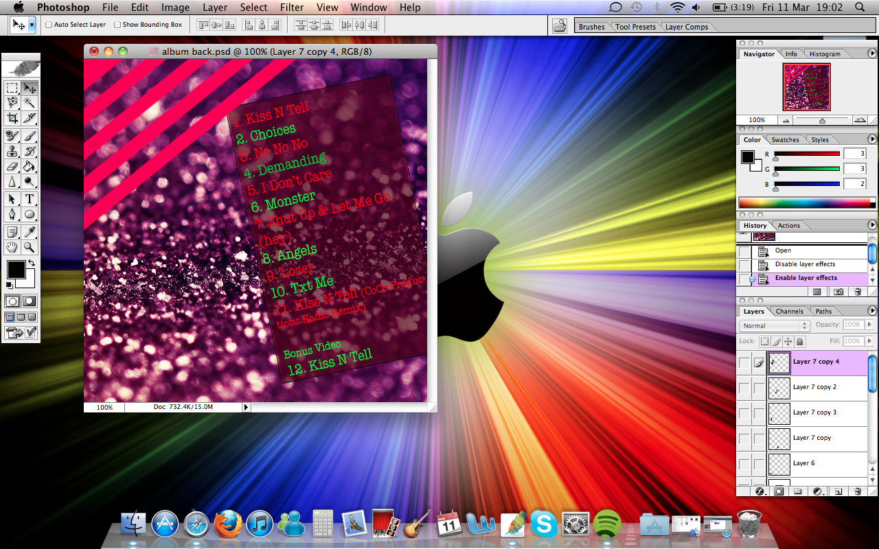
At this point, I put the track names in. I put them with different colours so that it wasn't boring however, they're still easy to see and do not clash too much with the background due to the box around it. I used neon green and neon pink because they clash with each other which fits the theme of the backing.
I realised that on other album cover backings, they have their production company and a logo for it, so I quickly made a rough logo on Photoshop:

And I downloaded a barcode and also a few music notes to remind the audience that although the artist is fun, she find her music very important and not just in it for the fame. This was the finished result:

No comments:
Post a Comment